The story in the data
Marine science interns turn to storytelling to clarify the numbers behind hypoxia in California
California’s beaches are integral to the state’s identity. But when Annie Adams and Mallika Gupta began their recent internship with the California Cooperative Oceanic Fisheries Investigations (CalCOFI), they found that many of their peers did not know about a major looming threat in the Pacific: decreasing oxygen levels, which cause what’s known as hypoxia.
CalCOFI — a collaborative founded by the National Marine Fisheries Service (NOAA), Scripps Institution of Oceanography (UC San Diego) and the California Department of Fish & Wildlife — has been monitoring California’s oceans for more than 70 years, creating a wealth of data. Adams and Gupta are both 2022 graduates of the University of California, Santa Barbara (UCSB) who majored in statistics. When they began an internship with CalCOFI the summer after graduation, they realized that data could clarify the causes and consequences of hypoxia. So they developed an interactive educational primer on the issue.

The primer uses a “scrollytelling” format, which allows viewers to scroll through different modules. The modules explain what CalCOFI is and reveal why California’s coastal waters are particularly vulnerable to hypoxia. Then, using CalCOFI data, Gupta and Adams developed charts and graphs that demonstrate recent decreases in oxygen levels.
Given natural variability in oceans, it’s not always clear what impact humans are having. Consistent sampling and long-range data sets are invaluable — which is why CalCOFI’s quarterly surveys will be essential to understand the future of California’s marine life, Adams and Gupta say.
California Sea Grant spoke with Adams and Gupta about how they approached the project and what they learned from it. This conversation has been edited for length and clarity.
Why did you create this primer?
Gupta: We realized a lot of people didn’t know what hypoxia was or hadn’t heard of the California Current. When we presented information to our peers, they were very interested but had no foundational knowledge of the subject, even at UCSB, which is right on the ocean.
Adams: We were able to combine our data-science knowledge, plus our knowledge of coding, to create the layout and interactive aspects. Our science communication background allowed us to make it more approachable and effective to viewers.
What is data storytelling?
Gupta: I would define data storytelling as contextualizing data. Nowadays, it’s so easy to collect and store data. The cost is getting lower and lower. But data is only as meaningful as the story it can tell. How can it illustrate the phenomena of our world? You can’t just do that with graphs and numbers; you need additional context.
Adams: You have to think of it in the eyes of the viewers: How can we make them understand this best?

Gupta: Data storytelling starts from a really zoomed-out picture: What is the issue we’re trying to look at? What can the data help us to understand about these phenomena? How can we leverage that information to know what our next steps need to be?
We have all these data on oxygen levels from year to year, but we needed to contextualize that within how oxygen changes in the California Current generally. And what are the stakes of changing oxygen levels for marine life and, by extension, California communities? Otherwise, people will be like, ‘Okay, 5.3 milliliters per liter oxygen — what does that mean to me? How does that matter?’
How did you think through presenting this material?
Gupta: We decided to break up this complicated subject into different modules that people could scroll between. That made our message and takeaway more cohesive and allowed people who might be familiar with certain sections to skip over what they already know. We wanted to meet the needs of a very wide audience.
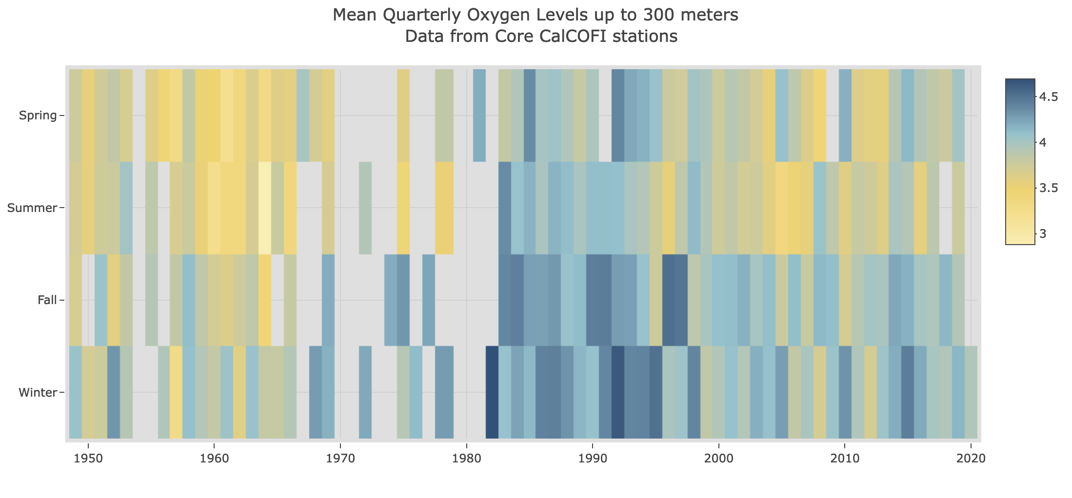
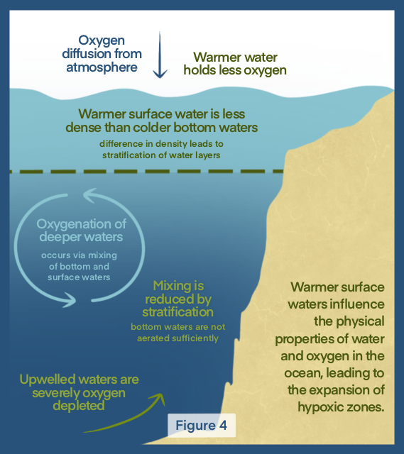
Adams: For the data components, we thought a lot about how to keep people engaged. So, for example, in the figure showing oxygen levels over time, we decided to invert the color scale from the default in our program. We made higher values darker and lower values lighter. We also wanted to make sure the trends were clear to help the instances of hypoxia really pop. To do this, we regrouped the data. Originally, we had the quarters organized in the order of the year: it was winter, spring, summer, fall. But we wanted fall and winter next to each other, so people could clearly see the differences in those seasons across the year.
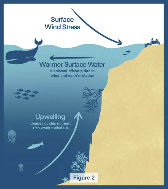
Gupta: Images are a very important consideration of any data story. I remember the first time I heard about upwelling — I was like, ‘This makes no sense to me.’ And then I saw a picture that depicted the process and it clicked. So we really wanted to be very intentional in giving people additional resources to understand some of the more complicated pieces of this hypoxia story.
As a part of your internship, you presented some of your findings to a high school science class. What did that look like?
Adams: We were originally planning to share just our hypoxia primer. But we decided that even more important than our primer is this aspect of environmental data and data storytelling. I think it’s really important to teach students about this huge and developing field before they get to college. We were able to create a presentation about what CalCOFI is and what environmental data science is. And then we did an activity with them in Excel that taught them a few of the many things you can do with data.
Gupta: I feel like a lot of people in our generation want to apply their skills and abilities to counteract climate change — to do work that feels really meaningful. So we just wanted to tell these high school students about all the different ways they might contribute to coming up with solutions to living on the planet more sustainably.
Adams: I loved creating our primer, but doing the school visit was the most meaningful part of the internship to me. These students are going to be future leaders on issues like climate change. Seeing sparks of interest in the students — it really felt like, I don’t know, I was ‘being the change I want to see.’ It was just really rewarding. We’re reaching out to schools and hoping to do more visits.
What have you learned from this project?
Adams: This internship confirmed that I want to stay on this path. It’s helped me to decide to go back to school and get my master’s in environmental data science. Working on this made clear that this is the field that I want to be in.
Gupta: Similarly, for me, working on the primer confirmed that I really enjoy storytelling. And I think that it is such an important and significant art that is often neglected. I think, in general, academic research can be inaccessible to people who don't have a college degree or even people with undergraduate degrees who are outside of the discipline. It felt very meaningful to be able to take this research and make it more accessible.